
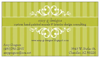
Option 1: To me this says classy, artsy, pretty. I love it. It's the direction I'm kind of currently headed, I think. But I don't know if it's really speaks to what I do. Brent says, and don't let this influence your opinion, that when he sees this design he thinks more of faux finishes than murals. Ick! That is NOT what I want to do.
.jpg)
Option 2: A different take on what I do. A (very) little bit edgier. And I love it, too! What is graffiti anyways besides painting on walls?! And the "Suburban" aspect makes it softer . . . kinder . . . friendlier. And the best response I've received to date is to my graffiti murals. Not that I want to be known for that. Or do I? (Obviously I would change the name of my design blog to match if I went with this option. I wasn't thinking this afternoon.)
So . . . if you needed a mural painted, which Amy G would get your business? I expect EVERYONE who reads this post to leave a comment. No holds barred. Love one, hate the other? Cool! Love the concept, hate the execution? Cool! Got a better idea? Cool (and I flippin' love you)! Hate 'em both? Cool! I'm a big girl. I can take it. I just can't decide on my own.


I love the second one. Faux finishes, yucky poo poo. Brent
ReplyDeleteShoot! I don't know...
ReplyDeleteI think the first one is nice - but it "blends". Not so Stand Out. But more professional.
I love the concept of the second one - but not so much a fan of the design. I think you should showcase some of your work ON the card. My aunt (the photographer) does business cards with a photo as the card and the type over it. I probably have one of my brother's laying around someplace...
YOUR ART WILL SELL PEOPLE! You are amazing - show it off!
But I LOVE, LOVE, LOVE the "Suburban Graffiti" concept.
Greg says "ditch the bird".
Congrats on taking this HUGE step! I love it! Let me know what I can do to help -
Tough, tough choice. I wouldn't be able to decide either. I love the classy nature of card #1 (and I don't think of faux finishes), but I agree with Tammy, not as stand out (there seems to be a familiar feel to it). Card #2 is awesome, but I also suggest changing the bird to some of your other artwork. Maybe you should take a picture of the inside of your closet and use that for a background. I love that closet. I want that closet.
ReplyDeleteALSO . . . these are just ideas I found pre-designed on the Vista Print web site so don't worry if you hate the artwork. It's not mine. This identity thing is in the very preliminary stages. But I have to say -- I like that bird. Whatever. It IS more of a tattoo design than a graffiti design.
ReplyDeleteI hate to be useless, but I like them both. Seriously. I guess it depends on who you're marketing to... and it seems like the second design would be best for that (?!?). I am not one to ask on these topics.
ReplyDeleteMostly I wanted to comment to say congrats and let you know I'm very impressed. You are so talented... very exciting!!
For what it's worth: I don't think the first one says faux finishes. However, I think the 2nd might scare off older (richer) clients...with the whole graffiti theme going on (?). Personally, I like them both but what will you clientele demographics be? Younger and hipper or older and more conservative? Could you come up with a middle ground? I don't have any ideas of what that might be, but just a thought.
ReplyDeleteOK, so I have been pondering this for a few days to try to give a coherent response. I like both the cards. I like the design on the first one better, but I LOVE the title "Suburban Graffiti". I'm all about words, you know. I understand that this title goes better with the second set of artwork, so I am a little at a loss for what to suggest. I do like the idea of including your artwork as the background. I second the closet idea - that closet background is beautiful. And the monochromatic with black might be cool as a business card...
ReplyDeleteBy the way - congrats on going for it on you business - you are going to do so great! I think it is awesome that you are moving on from the gym job and really diving in.
I am sooooo impressed with your work. I agree with Tammy and Greg--ditch the bird and showcase some of your work--like the tween room! I like the "amy g" wording alot too. What about "amy g's Suburban Graffiti"? Just a thougt. You are amazing is my main thought and impression.
ReplyDeleteOh, and I love the teeth also.
Dee
I think the first one is lovely. Classy, smart. Doesn't really showcase the kind of work you have been doing. Love the name Suburban Graffiti. Don't get the bird. Had a weird idea when I was up in the middle of the night with the baby...what if you painted "Suburban Graffiti" onto a wall or board (to showcase your style) and took a picture of it, then put text on top of the photo. Anyway, I don't know anything about design. I know you're very talented though. Congrats on becoming "official".
ReplyDeleteCynthia,
ReplyDeleteThat is exactly what I was thinking myself!!! It's like we share a brain. Now, if I ever find time to do that I'll post photos for further scrutiny.
I love Cynthia's idea! It would be perfect (and more time consuming). I also like the idea of the closet photo with Suburban Graffiti, to me it seems to be edgy and yet something I could covet and want you to paint in my house. Oh wait, I already do!
ReplyDelete